skip to main |
skip to sidebar
I generally refuse to take on anything that I’m asked to do. (I’ve been inundated with people asking me to do custom patches for them. Not interested. It’s fun when I do an unbidden one as a gift for a friend, but the “can you make shirts and hats for my entire softball team” questions got to be a little silly. I do this as a fun hobby. I really haven’t the means to do this on a scale other than that.)
But a lady at my work has a developmentally challenged son who has a thing for dragons. I made an exception in her case when she asked me. And I’m really pleased with how it turned out.
Not sure I’m quite as enamored of Apple as I was 30 years ago, but their computers have played an important role in my life for that whole time.
(For part 1, look here.)
I stopped making patches for a while, because I was busy doing other things, and it started to frustrate me a bit too much. Mainly the interchange between my Illustrator file and what the embroidery software spat out. All sorts of oddities were generated, and trying to correct them was just too time consuming.
Took it up again a few weeks ago. I still get some weirdness occasionally when I convert to an embroidery file. But I’ve learned some ways to work around it. I also try to forego filling an entire background with embroidery, rather letting the background show through. I’ve also realized the old tattoo adage of “bold will hold” is a good one to follow. I generally do pretty iconic images, and try to avoid cutting out really complex shapes. I’ve also learned that a file for printing and a file for embroidery are two very different things. I’m still just using scraps of 420D nylon. Not sure if that’s the recommended material, but I have loads of it, and it seems to work okay.

Ourobouros.
Canoehead, or more properly, the portage sign. I still don’t have the means of merrowing the edge, so I still cheat by doing a satin line around the edge, cut very close, singe then ends with a lighter, and then colour the edge with a marker or acrylic paint. Adapt. Improvise. Overcome.
Death’s Head Moth.
A name tape for myself, using one of my typeface designs. (Which I realized I did 25 years ago. Yikes. Where does the time go?)
And my logo as a patch.
Here you can see looping stitches that occur some times. I just cut them away and singe them. Not sure what causes it or how to prevent it.
Two different apertures. (The top one shows an anomaly that occurs sometimes; the bobbin thread showing through. Nothing a black marker can’t fix though.)
This might be a good time to show some of the glitches generated by the embroidery software.
This is what you see when you first convert your file. (This is Janome’s Digitizer software.)
Go to “TrueView” and this shows. Huh?
Zoom in. No rhyme or reason for it.
My high tech fix? Flip the image in Illustrator, and it shows up just fine. Huh? Like I said, no rhyme or reason to it.
I’ve spent 30 years off and on as a graphic artist and pre-press tech, so I wanted a CMYK crosshairs.
Still have to finish the edges. Tatami in the quadrants, satin for the ring and crosshairs.
In the yellow quadrant you can see what happens a fair bit on curves. It forms the outer ring by first drawing an outline and then going back and forth over that. For whatever reason, there’s a section that isn’t covered. Don’t know if the embroidery of the four tatami sections changes the tension of the fabric that much, if there is slack in the fabric, if it’s a structural flaw in the embroidery file... Not sure.
Did one with the “Satin” setting (on the left), and one with the “3D Satin” setting (on the right). The first was 4629 stitches, and the other was 13445 stitches.
Predacon logo for a friend. Thought I’d try it with variegated thread.
A S.T.A.L.K.E.R. PMC faction subdued patch for a friend.
Crummy old one I did a few months ago on the right, new and improved one on the left. The old RCAF roundel.
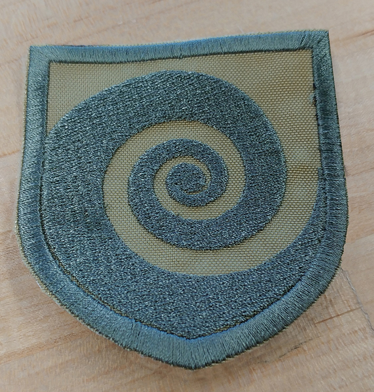
Spiraloctotentacle.
As a type dork, one of my favourite characters is the Ampersand. This one is from a House Industries T-shirt that I wore to destruction. Will probably get another one at some point, but stole the design for a patch for myself. Sorry House.
An old Mac icon.
First attempt at a Technics turntable patch. Too small, and all the dots on the side of the platter blaed together.
Really thick lettering. Not good.
Attempt # 2. Larger, and I made the dots and type smaller, to compensate for the bleed that occurs. You can see how much curl there is on the first one.
Sigil of Baphomet for a friend.
And sorry to all you religious people that I’m making you look at this again, but it demonstrates a point. You can see the colours here do not match the above image in the slightest. The reason I do that is that the screen that comes up on the embroidery machine itself is tiny, and doesn’t give a great representation of the colours. Especially if the colours are in any way similar (two reds and an orange, say), it’s really hard to distinguish between them. Giving them bright, contrasting colours makes it easier to figure out which is which. I can put whatever colour of thread I want on there, and this just makes it a bit easier to figure out on the screen.
Some Star Wars patches I made for a friend.
It’s true. I do.
Another example of the oddball, “why you do that!” things the embroidery software does. Go into Illustrator, flip the image, flip the I ♥ LEGO back, import it again and ... weird fill is gone. Makes no sense.
On the left is an attempt from about a half year ago. I tried a smaller one 4 up in the hoop and then I tried a larger one 1up in the hoop. I got that misalignment at the top right of the O and the bottom left of the L on both. I managed to cheat and black the area in with a marker, because gosh darnit, I really wanted a Lego patch. Tried it again, this time with some red material rather than trying to fill in a whole background. Much better this time.
Some more inexplicable weirdness. I created this file in Illustrator, and yet when I brought it in to Janome’s Designer, it assigned a tatami fill to the L, and satin to the E, G, and O.
Looking closer, you can see that the area behind the L is knocked out, but not for the E, G, and O. Huh? Went in, and I managed to remove that area behind the L so that there was now a solid black and changed the L to be satin as well.
Wookie.
I doubt I’ll ever stop finding the Golden Ratio fascinating.
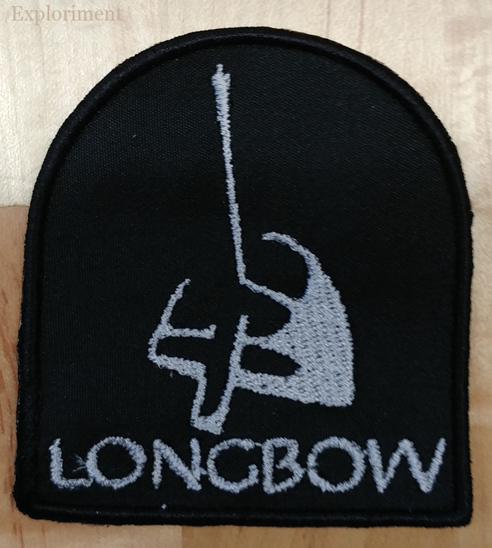
Ryan Adams for a friend.
Hard to tell from the photo, but the patch is the same size as my beloved Swiss Army Knife. (A Huntsman I’ve had for 25 years in case you’re curious.)
View-Master reel.
Glock patch for a friend. I’ll make one for myself to antagonize the hippies.
Huge part of the Canadian cultural landscape. Fond memories of being a kid fresh in Canada, the lights in the classroom dimming, the whirr of the projector starting up and the magical images projecting across the screen. Classics like Helicopter Canada and Paddle to the Sea (along with other Bill Mason films) helped shape my perceptions of this new to me land.
(And as an interesting aside, the name “Boards of Canada” took their name from this very organization. As kids who spent part of their childhood in Canada, they too were very inspired by NFB films.)
I
was a huge 4AD fan in my teens. Would buy records sound unheard just
because it was on the label.
The top two were very early efforts. Not
perfect. They often aren’t. The white and black one stair stepped a bit
along the top, and the grey and black one had the thread get messed up
in one area. I can fix it.
I made them fairly large, because my early experiments seemed to indicate that they needed to be large-ish. After a while I figured out that wasn’t necessarily the case, and I did a much smaller version.
Rendezvous on Champs Elysées
Leave Paris in the morning with T.E.E.
Trans... Europe... Express...
The
patch on the right was one I did about a half year ago. Made it too
small and there was too much infill. Learning as I go. Went back and
opened areas up to avoid that, and made it larger.
Now I have myself a Kraftwerk patch!
I mentioned in my writeup about the fantastic makerspace at the library, the Janome embroidery machine. It took a little while, but I’ve jumped into making patches with gusto.
First thing I tried. Didn’t entirely work out. Bobbin ran out halfway through, and made a slight mistake in the rethreading, and it started showing up top. Fixed it, but the damage was done.
Still, for this being my first time using this machine, not bad. I expected worse.
Second project. I’ve written to that calcified and hidebound institution, the Canadian Legion 3 times asking them to offer an embroidered poppy for sale. Nothing doing. That pin drives me nuts. Catches on things, rips stuff, falls off, contributes to the plastic clogging our oceans. So I took matters into my own hands.
Then came a 3 colour variation.
Lessons I learned up to that point: Make sure you replace the bobbin cover, trim the end of the thread coming out of the needle to be about an inch long, otherwise it might wrap itself around the presser foot and when that happens you can toss out your project as it’ll get out of alignment and there’s no getting it back. Same goes for not tightening the hoop screw enough. If it pops out, it’s over.

The thing that was at the top of my list of things I wanted to get into making patches for. The Cottage 13 logo. My first attempt is on the right, the second on the left.) Used a different white, grey and gold thread. Made some changes to the Illustrator file. (Widened areas, thickened lines, etc.) Applied a different embroidery effect to a few areas. Still trying to deduce how to change the stitch direction for consistent effects.
As I’m learning by this point, there is a very steep learning curve to this. Once the vector file is converted into an embroidery file, all sorts of weird things happen. And figuring out how to make it conform to what I want is proving to be a challenge.
Another attempt at my logo shield, and a “maker” patch, using my typeface design Nephilim. In the shield you can see a divot in the top right, and on the maker, the ... serifs ... if you will, are for whatever inexplicable reason, treated as separate objects.
Here you can see how things get pulled out of alignment. I thought it was because the material wasn’t tightened enough in the hoop, or having it 4 up, but the same thing happened when I set it one up, and about double the size. I managed to get one decent one out of it by cheating and blacking areas in with a marker. Pretty much second on my list of patches I really wanted.
Got two different sizes.
Being a proud Amsterdammer, one of the patches I’ve wanted for a while is a crest of the city. I like it partly for how bold yet simple it is. It’s like heraldry and post modern graphic design had a night of drunken sex and this is its offspring.
Made this one for a friend, but will likely make one for myself too, just to annoy the hippies. :-) One of the things that is proving tough, is small letters.
Some music I”ve been a fan of for a long time. ASF maybe not so much, but the others certainly. 242 especially.
Patch I made for my pal Andrew Kent as a Christmas gift.
Gavin asked me to make this Pentatonix logo patch for his daughter for Christmas.
Way too imperfect for my tastes, but I made myself an RCAF roundel patch. I’ll call it the Patch, Embroidered, Roundel, RCAF, Mk. 1. The yellow band needs to be thicker and more prominent.
I’m rethinking my initial impression that embroidery is a straight forward thing. It”s anything but. Some initial luck has been followed by a lot of WTH?!’s. That setup fee the company charges to have your golf tournament logo digitized to put on a shirt? Just shut up and pay it. I think they’re probably losing money on it.
Jun Matsui logo and a name patch.
Here’s an example of what happens when a computer algorithm is left to figure things out. No easy way to remedy things like that.
Another of the inexplicable things that has happened a few times is in circles like this, a line of stitches that run horizontally show up despite the vertical stitches over it.
All in all, a vector file for printing and a vector file for embroidery are two totally different things.
And professional patches have a nicely finished border on them, done with a Merrowing machine (or an overlock or serging machine if you will). I don’t have access to such a thing, so I do a fake finish. Do a seam and then carefully cut and singe the ends with a lighter.