Wednesday, 9 March 2011
S.o.t.D. - Clocks – Coldplay
Clocks – Coldplay
I know these guys are huge, and it feels like a bit of a guilty pleasure...but I totally love Coldplay. I tend to listen to very little stuff that sells out arenas, but I totally dig their sound. The album this came off of I think is a really great “album”. From start to finish I think it’s totally solid.
Tuesday, 8 March 2011
Engravers Initials 2
Another one I just did for the tattoo shop. It’s also from Dan X. Solo’s Gothic and Old English Alphabets from Dover Publications. I reckon it’s a bit of a garish monstrosity (I like the E and a few other characters though), but folks still want to get stuff tattooed on themselves in it. Okay then....


If I don’t know much about the provenance of Engravers Initials 3, this one is a total mystery to me. I’m going to guess it hails from the Victorian era?
Like Engravers Initials 3, this one was pretty sloppy, so I tried my best to clean it up. I added a few alternate characters as well. Fun one to kern, that’s for sure.
Engravers Initials 3
I did this up for the tattoo shop. It appeared in Dan X. Solo’s “Gothic and Old English Alphabets” from Dover Publications. I really don’t get this obsession people have with getting lettering tattooed on themselves in “Old English.” (bbbaaaaahhhh) But customers who browsed through the books at the shop to pick out a lettering style that they liked, often picked this one. But we couldn’t find it anywhere as a digital typeface. Photocopying and cutting and pasting it on a curve got very long in the tooth, very quickly. So I was asked if I could transform it into an actual typeface.


I don’t really know that much about blackletter (as “Old English” is more correctly called.) I know enough about it that this is probably classified as a Bastarda. But I’m not a calligrapher, so I only have a vague understanding of specifically what era and region this came from. Was this from a 13th century German psalter or an 18th century English display typeface for handbills? I don’t know. I’m also not sure if this would have been done with a pen or a brush, or if it could be done with either one. To be honest I’m pretty ignorant of the whole scribal tradition. Type for me starts with Jenson and Griffo.
I’m also not sure how Mr. Solo compiled this. Did he or an underling actually draw this or was it merely copied from a source with a stat camera? I suspect it’s the latter. It’s totally got that look of something that was done at 12 point and then blown up about 10-fold at least on a stat camera. There are a fair number of inconsistencies in it, the size and colour seems to waver, and the thickness of stems and serifs seem off in places as well. The weirdest thing though was the Z which appears to come from a totally separate typeface altogether. Whether it fell off the paste up board at the printers and they stuck the wrong one back on, or whether the face didn’t have a Z at all and they copied one from another and figured that would do....no idea. I think the idea of this book may have been that it was supposed to inspire budding calligraphers, who would then draw it themselves.
I made an effort to remedy some of the inconsistencies, and I made a completely half assed attempt at a Z. My lack of understanding about the underlying structure and intent of this typeface made it only a very mediocre attempt. Kerned it very nicely. Added a couple of alternates as well. There are swooshes on the left hand side of the V and W, so I added one of each where they were raised up quite a bit to avoid crashing into whatever was on the left of them. Also did them up a version without those little bars. There are still some imperfections in it, but it will most definitely allow the artists at the shop to set this much quicker, on all sorts of tricky curves, with whatever outline they like, etc.
Monday, 7 March 2011
Logo - ThinkHaus
I’ve been playing around with a few logo ideas for ThinkHaus. This is one rough idea. Going for a computer chip feel.


Sunday, 6 March 2011
S.o.t.D. - Kin Ki Utsuri – King Kooba
Kin Ki Utsuri – King Kooba
The only bad thing about this track is that it isn’t actually 10:40, but only 6:02 long.
The only bad thing about this track is that it isn’t actually 10:40, but only 6:02 long.
Saturday, 5 March 2011
Friday, 4 March 2011
S.o.t.D. - Hybrid (PFM remix) – Eat Static
Hybrid (PFM remix) – Eat Static
Much smoother than the original which was just way to frenetic for my liking.
Thursday, 3 March 2011
Behance
Finally got my ass on to Behance. I needed an online portfolio and it seems to get good reviews from all my creative friends. There are several online portfolios and I’m thinking of getting on to a few of them.
Behance seems pretty straightforward, but I wonder if it isn’t a place where it becomes easy to get lost in the absolute deluge of stuff that gets posted there. I posted some stuff, and 20 hours later went back to post some more stuff and also to have a look at what else had been posted by others. Page after page of stuff. After a while I stopped actually looking at other peoples stuff and just out of curiosity started to see how much had been posted. 12 items per page. After just shy of 150 pages I found back the last thing I had put up. Wow that is a lot of people putting up a lot of material. I realize that quite a few disciplines are represented, but that is still a pretty staggering volume of work being shown. I suppose as a quick way to show a prospective employer or client some of what you’ve done it’s fine, but as a random showcase for your skills, I wonder how well it does.
Another thing I realize is that I need to take much better pictures of my stuff. I don’t have a great camera, and for the purposes of a blog, where I just want to quickly throw up what I've done to share, it’s fine. I tend to have a ton of ideas in the hopper that I’m working on and want to get to. I finish one thing off, snap some shots, process and edit them, throw them up here, and then it’s off to the next project. But that process of getting photos, downloading them on to my computer, sorting what is okay and what isn’t, rotating them, cropping them, editing them, saving a smaller version, putting a watermark on them, flattening that - I shudder to think how many hours I’ve spent on that in the time I’ve been doing this blog. Hundreds of hours. Weeks of time. Some of the steps I’ve created actions for and I can just batch them, saving me some time. Some things still require a human hand though. Selecting, cropping.
For the sake of an online portfolio, and looking at the high quality of photography others are using to showcase their work, I feel decidedly inadequate at some of my half assed photos. Time to devote some more time to taking some better photos. *sigh* But...lots of the product designs I’ve glanced at seem to be 3D renderings. Now I’m impressed by the ideas shown and the ability represented by the 3D renderings. But I feel somewhat more confident in the fact that I have actual products to show. A mockup is great and all, but to my mind it’s trumped by a physical object. Unpolished as some of my items may be, it’s considerably further along the process than a rendering is. I suppose that if I had gotten a proper education as an industrial designer, I would place more emphasis on the rendering part, but I’m merely an amateur tinkerer. I just want to get on to the actual making. To me the proof is in the pudding. I suppose also that it really depends on the item being created. For some things a detailed rendering to present to the client may be the only feasible way to go. For sewn goods, if someone wanted me to make a...messenger bag say, I could likely whip one together faster than I could do a rendering of it. And an actual object the client could hold in their hands might do more to sell it than a rendering could.
But hell, if I had access to the software, I would likely love it to bits and be teaching myself to use it and creating all sorts of nifty stuff with it.
All right. Enough writing. I have to get back to working on the logos and typefaces I have on the go right now, so that I have something more to feature on Behance. And here. And maybe Coroflot soon as well. And maybe Deviant Art. And....
S.o.t.D. - Dream Again – Kick Bong
Wednesday, 2 March 2011
I’m high on the crack! And I love it!

Okay, so it’s not quite what you might imagine. Needed a picture of myself, and since no one should be subjected to my hideous mug, I though this picture might do the trick. It’s me in the picture all right, standing atop the Crack in Killarney, drinking in all the awesomeness. One of those truly wondrous moments life has to offer. (photo taken by Jason Irwin.)
Monday, 28 February 2011
Sosoetry - Sunboy
My brother from another mother.
there is a lad named Sunboy
there is a lad named Sunboy
knowing him is truly a joy
since he was a tiny tyke
he loved to go fast on his bike
soon he was training at cycling camp
and transformed into a racing champ
pumping ferociously those pedals
and winning fistfuls of medals
but one sad and fateful day
chance would make a cruel play
he sustained a serious head injury
all because a moron was in a hurry
he could have ended up dead
or confined to a lifetime in bed
for a time the grim reaper hovered
but in due course he recovered
he certainly beat the odds
possibly he’s smiled on by the gods
some would consider him a golden child
others might think he became a bit wild
taking acid at the grateful dead
did a lot to mend his scrambled head
he took his settlement cash
went to India and smoked hash
spent months in Nepal
and had a ruby temple ball
became a born again buddhist
and indulged his desire to be a nudist
bought many beautiful killims
and learned to use a chillum
he stayed at an ashram with a brahman
and came home looking like a rastaman
but to running a business he kept himself applied
keeping many artists well supplied
at various endeavours he is quite able
from mixing tunes on turn tables
and the ancient art of tattoo
well it seems he’s learning that too
he finds it tough to tattoo rigid shapes
but he sure can create wicked mix tapes
he always throws a fine birthday bash
at which he freely shares his stash
spinning sets of juicy beats
sharing with friends some tasty treats
on his shins are shivas from Goa
on his chin’s a chevron from Samoa
at one time he had dreads
now he simply shaves his head
his home is scented by nag champa
a house he shares with Yolanda
he lives with a cat that is quite mad
yet she loves him as though he is her dad
that nasty rotten surly cat
only he’s allowed to give her a pat
he speaks with a booming voice
and goes through life with honour and poise
he comports himself with more class than any royal
to those he loves he’s true and loyal
he’s devoted his life to a fine lady
together they’re soon to have a baby
I don’t think he’ll find it a bother
to be a really superb father
he’ll take the responsibility in stride
and see to it their child is raised right
to many people he is a great friend
let’s hope he remains so till a distant end
S.o.t.D. - Reflector - Medeski, Martin & Wood
Reflector – Medeski, Martin & Wood
I’ve been peripherally aware of these guys for a long time. Know people who really like them. I’m sure I’ve heard them at some point on the radio. Sort of a jazz influenced jam band I guess. But for whatever reason, they slipped under my radar.
While at the library the other day, the cover of End Of The World Party (just in case) caught my eye. Like the cover, maybe it’s time I check these guys out.
Oh do I feel silly now. I really like this record. It’s like these guys have a stew pot of influences and have been letting the various flavours blend into a really tasty creation.
Jazz, blues, funk, folk, psychedelia, dub, rock, electronica. Quite a blend of instrumentation as well. Some tracks will feature say a Wurlitzer and electric guitar, others will feature horns and a piano, and other will feature synths and a stand up bass. The switchups in genres and instruments I really dig, and I really dig what they do. I’m sure some deride them as nothing more than a noodley stoner jazz/rock band, but that is not a problem for me.
Clear the decks! I am definitely going back to the library to see what other MMW recordings they have.
Sunday, 27 February 2011
Hawk
I left the tattoo shop and about a block away I heard a screeching sound so I looked up. I saw what appeared to be a falcon being chased by a big hawk, which then seemed to give up the chase and settle in a tree. Like it was too slow to catch up, so it saved its energy for something else. I could be entirely wrong of course, but I suspect that it wouldn’t be past a hawk to kill a falcon if it could. I doubt there is that much honour amongst raptors, or some sort of noble bond between hunters of the sky.
“Hey! Dinner. Bit more of a challenge this time.”
Wolves have no compunction about killing coyotes, so why would it really be any different amongst birds of prey.
Didn’t get any spectacular pictures of it, since I only have a hohum camera. Just cool to see it that big right in the city.
I walked underneath it to snap some photos of the other side. Right as I did it took off, so I missed my chance to photograph it in flight.


Bibliophilia: Daemon & Freedom™ by Daniel Suarez
I read a LOT of books, lots of thrillers, and it’s rare for me to find one that I don’t enjoy.

 But these two books I LOVED!
I tore through Daemon and then Freedom in two successive nights. I can’t recall a novel or novels in recent memory which gripped me that much, where I found the characters that engrossing, where I was both filled with utter dread and then a growing sense of wishing that this could happen for real.
Great stuff! Some of the high end computer stuff went over my head, but at no point did it bog down into techno jargon. It helped build up the story, but the plot and characters drove it all the way.
First time I’ve ever felt compelled to write an author and tell him how much I enjoyed their work.
http://www.thedaemon.com/
Nerf’mups

Here is trainee covert agent (code named) “Curly Red” of N.E.R.F. (National Emergency Response Force) undergoing arduous training by experienced members of N.E.R.D. (Netherlands Elite Recon Detachment). The trainee has just been handed an Exploriment Laboratory Nerf’mups to test and evaluate. The Nerf’mups is the latest in elite tactical specops commando Delta Ranger sniper covert SWAT mission counter-terrorist SEAL operator hostage rescue gear!! Red’s face has been obscured so that if he passes the rigorous selection and training and goes on real covert missions, he won’t be recognized by the evil forces arrayed against good order, decency and sanity.


On the right hand side is a Maxpedition Holder for his HyTek Komms X-5000.

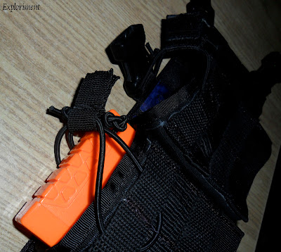
Closer view of the Exploriment Laboratory Nerf StrikeFire Holster’mups, with a ready array of D.A.R.T.s (Debilating Ambulatory Resistor Traumatizers).

On the left hand side is a Maxpedition MiniRollyPolly, for quickly stowing spent mags in the heat of fearsome exchanges.

View from above.

Ammo ready and loaded for instant reloads. Strikefire ready and loaded for immediate response.

Besides chest rig mode, it can also be worn as a shoulder bag....

...or in bandoleer mode.


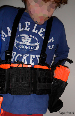


I had the idea to make him a holster and a chest rig for his Nerf setup. He was running around trying to cram a Nerf pistol in his waistbelt and lugging a sleeping bag sack filled with magazines and loose darts around.
“No really, this works fine.”
“That nonsense makes the baby Buddha cry.”
So I built him this. I admittedly didn’t make it to the highest standards. I used up some crappy fake Cordura from a “Flash In The Can” conference attache case, some 420D-ish material, and some crummy floppy webbing I had from ages of scrounging. I didn’t sew it to exceptional tolerances. No bartacking, no triple stitching. It’s a kids plaything. No need to go overboard.


Saturday, 26 February 2011
Bibliophilia: Red – Warren Ellis & Cully Hamner

Gritty, blood soaked tale of a former CIA assassin who wants to be left alone to live his last days in peace, but who the new DCI wants dead. No reason given is ever given, but be sure that mayhem ensues.
S.o.t.D. - Travelling Light - Tindersticks
Great band, great singer. Actually, two great singers on this. I tend to like more upbeat stuff for the most part, but melancholy stuff like this I find undeniably appealing.
Friday, 25 February 2011
Modified 82 Pattern Field Pack
Going through some old photos recently I came across one of my very first attempts to modify gear to suit my needs. Funny to see it again. This stuff goes back at least 15 years.
I used military gear in ways that was entirely unintended, and used whatever suited my needs. Stuff from a few different countries, and a bit of civvy stuff as well. I was hauling around a pack filled with freight and still wanted to have some snivel gear that I could detach in a hurry, and then attach to a belt. At the time, I figured a butt pack was my best option, and got a Canadian one.
 Proprietary attachment system (a bit more on that later) removed, and enough of the webbing that held it in place left to allow insertion of ALICE Clips.
 Another change was to put a carry handle on the top.

 I also put webbing on the sides to attach canteens to. All I had access to was webbing that was ultimately too floppy to really support the weight of full canteens. It held up I guess, but it didn’t work that well either. I learned.

 In time it too was taken apart to serve in the making of other stuff.


82 Pattern was Canada’s web gear for several decades. Pretty decent I suppose, although I never really used it the way it was intended. The proprietary attachment system was what I personally wasn’t so keen on. I guess it was fine for a military obsessed with uniformity like Canada’s was for a long time. (Fortunately that mentality is changing as the reality of conflict in Afghanistan drives home the point that the one size fits all approach doesn’t work beyond the parade ground). I suppose the option of adding private purchase gear or home made gear or equipment from other countries wasn’t ever an option for Canada’s soldiers back then. I had no such restrictions. I had some British and American pouches and none of them worked together. At the time US ALICE clips seemed to be the best option out of all of them (I wasn’t as savvy at the time), so I decided to switch over to that.
I never took photos of what the attachment system looked like, and I can’t locate any with a search engine. To give you an idea of what it looked like, here are some diagrams from the instruction manual.

 The 82 pattern belt was a wide belt with grommets along the edges that the prongs from the plastic attachment system went into. Since I didn’t have the belt, only an American pistol belt, it wasn’t much use to me. Not to mention that none of the American or British or Dutch stuff I had worked with it.
I never took photos of what the attachment system looked like, and I can’t locate any with a search engine. To give you an idea of what it looked like, here are some diagrams from the instruction manual.


For some more views of it:
http://www.freewebs.com/restigouche/C-87-248-000_MB-000_-_Users_manual_-_1982_Pattern_webbing.pdf
Subscribe to:
Comments (Atom)


