Showing posts with label Paul Sych. Show all posts

Monday, 3 January 2011

Type Design - Zig, Zag, Zoo

More production work than design work really. I wish I knew who designed these originally, probably some time in the 60’s. Paul Sych found a printed example of these somewhere and since he couldn’t find a usable font of them anywhere, got me to digitize them. Done for YTV.

Friday, 26 March 2010

Logo – Faith

I did this just for fun back in 95, when I was working on typefaces for Faith. Pretty much just exploration of an idea.

Sunday, 21 March 2010

Type Design – Faith Production Work

Back in 94, 95 Paul Sych of Faith asked me to do the production work on a typeface package he was going to release through Thirstype. (Sadly it looks as though it’s no longer available from them.)

I created the analphabetic, accented characters, set up the kerning tables, and in some cases, created variants (italic, bold, outline, etc.) 

One of the faces was Wit, which was inspired by the experimental typography of Kurt Schwitters. One of the Dadaists, he created a system of Systematic Letters. Consonants are narrow and square and vowels are fatter and round.
This shows some of the characters I did and some of the variants. 
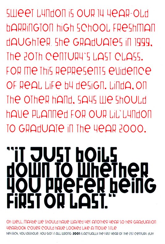
A piece done by the awesome and inimitable Rick Valicenti of 3st utilizing Wit.
And some examples of how Paul used it in a magazine he art directed, Impact.

Another of the typefaces was called Fix, the lower case of which is shown below.
I’d always been into remixes of music, and I figured it was perfectly valid to extend that idea to type as well. So I created the Fix Sin Mix.
I also created the Fix Ram Hog Mix, quite possibly the most unwieldy font in the world. Each character contains +- 300 to 600 points. The .fog file was massive. Clever in concept, preposterous in execution.
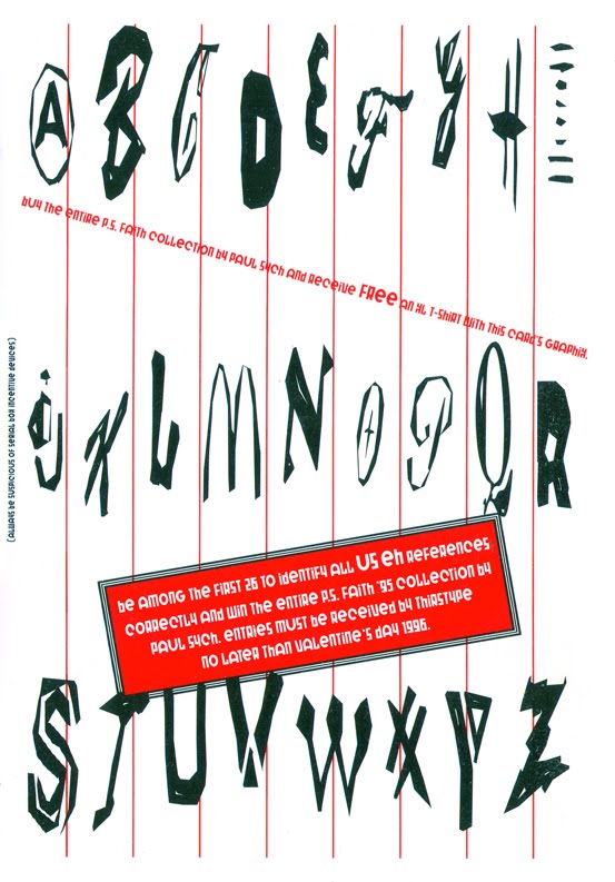
Another of the typefaces was USeh, a very clever typeface/commentary on America and consumer culture. 
A postcard designed by Paul for the release of the P.S. Faith typeface package.

Some more examples of Paul’s typefaces in use, can be seen here.

Thursday, 10 September 2009

6° of Typography

In April of 96 there was a typographic symposium in Toronto with lots of big names that I very much wanted to meet and hear. The cost was out of my reach (being a type designer will do that) and much to my regret I couldn’t attend.

The event was on a Friday and Saturday. I consoled myself by going out to a little electronic music shindig on Saturday night, and ended up having a phenomenal time. The next day I went out for lunch on Queen Street with my friend Jean-Michel from France. As we left the restaurant, we hadn’t walked more than two dozen paces, when I passed some men speaking Dutch. I figured they were just tourists and kept on walking. A few paces on however I realized that I recognized one of them. “Wait here” I said to my companion and ran back.


“Excuse me, but are you Gerard Unger?” I asked in Dutch.

“Yes I am,” he said with a rather surprised look on his face.
“Hey, and you’re Just van Rossum and you’re Erik van Blokland.

I introduced myself, explained who I was and what I did. We proceeded to stand there and chat for several minutes, I showed them what I did, and we exchanged cards.


“Yes Paul Sych was telling me about you. If I had known about you before hand I would have snuck you into the conference,” Gerard Unger said, much to my chagrin of course.


But I still thought it was hilarious to meet the three people at the symposium I most wanted to meet, completely by chance. If I had left the restaurant thirty seconds later, I would have missed them. The other amusing thing is that Just and Erik were both born around the same time as me (Just in 1966 and Erik in 1967) are both as tall as me (2 meters), they’re Dutch and they design type.


They inquired where a good place to eat would be, and after discussing the many possibilities, I pointed out the direction to a good Indian restaurant. This happened to be in the direction where my neglected friend was. He had waited patiently for me this whole time. I introduced everyone and Gerard Unger, being a very personable man (I think avuncular would be a good term to describe him) asked Jean Michel what he did.

“I’m a DJ,” he replied.
“Ah, my son is a DJ in Amsterdam.”
“I know several DJs from there. I actually played a record last night by two guys from Amsterdam, Remy and Sven from Global Cuts.”
“Ah yes, Remy is my son and Sven is my nephew.”

My brain was pretty much reeling at this point! One strange small world incident was followed by another in rapid succession.


A while later I got a call from Joe Clark, a writer who specializes in design.

“Hey I hear you accosted Gerard Unger and Letterror on the street.”
“Yeah. How did you know?”
“David Michaelides from FontShop told me.”
“And how did he know?”
“They told David because they were utterly flabbergasted that someone in Toronto not only recognized them, knew who they were, and could speak to them in their native tongue.”

The next day I was on the phone with Patric from Thirstype.

“So I hear you bumped into the Dutch boys on the street.”
“Yeah how did you know?”
“Just told me. He thought it was hilarious that you knew who they were, and went up to say hello. He said it made him feel like a famous rock star.”

But it gets weirder. FontShop published sheets with bios and small portfolios of notable type designers. Gerard Unger was one of them. It made mention how he got his start at a very famous Dutch ad agency Total, run by esteemed typographer Wim Crouwel. I showed this sheet to my mom for her to get a sense of who I had met.

“Oh I know Wim Crouwel,” my mom says.
“Huh?! Are you sure?”
“Yes your dad used to play baseball with him.” (My father was a really good pitcher and played on the Dutch national team in the 50s and early 60s.) “Yes I’m certain of it, Wim Crouwel. He was a catcher.”

So there I was, thinking my dad used to lob baseballs at the head of a luminary in the world of typography. Wow. As I was to discover later, it was another Wim Crouwel, born the same year, but a physiotherapist who lives in Amstelveen. So, a weird coincidence, but not that weird a coincidence.