
Saturday, 31 October 2009
S.o.t.D. – Moving Like A Train – Herbert
Friday, 30 October 2009
S.o.t.D. – Sweet Like Chocolate – Shanks & Bigfoot
Likely the biggest hit to come out of the whole Garage scene. Totally infectious tune.
Logo – Clan of Xymox
I did this back in 1990 for a magazine article. I used Letraset, blown up PMT’s, cutting and pasting, more stat camera trickery, reversed film, scanning, redrawing in Fontographer, etc. Just a crazy amount of work. This was before the days of being able to turn type to outlines, which would have made it all really easy.

HSGI Nalgene Pouch Modification
I got two of these High Speed Gear Nalgene pouches. One in olive drab, and one in black. Typical HSGI quality.

The only negative about it is that it’s meant for a bottle and not much else. I like having a pot to go with the bottle. Having just a cup or a pot on the bottom would make it a tight fit, but I wanted to use the Snow Peak Mini Solo, and that really made it a tight fit.

I wrapped the clangy handles in hemp cord to silence them. What I really need to get for on there is some sort of fire proof tape.
 To help get everything back out of the pouch, I installed a lifter strap. This shows it sewn into the back.
 The two grey dashes above the webbing…
 …are the sewn edges of a tab to keep the lifter strap in place.
 Even with the lifter strap in place it’s still a challenge to get the cup and the lid out. But it’s still better than not having it there.
Since these photos were taken I got a bunch of stuff from Kifaru, including a LiterPlus Pouch. This is the pouch I now keep all this in, and the HSGI Nalgene is where I keep my second bottle.


Since these photos were taken I got a bunch of stuff from Kifaru, including a LiterPlus Pouch. This is the pouch I now keep all this in, and the HSGI Nalgene is where I keep my second bottle.

Typeface Design – Nephilim

Barry Deck’s Cyberotica became one of the ubiquitous typefaces of the 1990’s. (Some might say one of the overused typefaces of the 1990’s. Neville Brody’s and Emigre’s typefaces also come to mind.) That’s not to say it isn’t good. Personally I think it’s a terrific typeface. But that still didn’t mean that I was going to use it. What I did do with it however was use it as a starting point to create a whole new typeface. The genesis was, as it usually is, a logotype. A few characters are created. Sometimes it never goes beyond those few characters, and other times the possibility exists to extend it into a whole alphabet. That was the case here.

What I used was the left portion of the W, and transformed that into a full typeface.

Fun display face, that works well for some letter combinations and not for others. I try to use it judiciously. Better for a logo or a headline, not for whole passages of text.

It exists in three weights.
Done around early 96.
Thursday, 29 October 2009
Sunday Autumn Hike
I’ve been sitting on my butt for too long, so decided to go for a wander on Sunday. Temperatures are perfect, colours are vibrant, time to get out there and enjoy. Consumed some Pillsbury Doughboy products and off I went.

The general region I would be walking. More over to the right of the picture than the left of the picture.

The yellow leaf road.


Them trails be paved with goooollld!


Chip Monk, the chipperest chipmunk around.


Along the way is a neat old information board with a bit of the history of Cootes Paradise and the Desjardins Canal. This shows the route that boats would have had to take in order to get to Dundas. For quite a while Dundas was one of the largest settlements in Upper Canada, but it’s growth was limited by the difficulty of getting goods out to the Lake or into Dundas from the Lake. The first hurdle was a large sandbar between Burlington Bay and Lake Ontario. There was a shallow route through it, but it was often intermittent. A proper canal through it was competed in 1826.

Cootes Paradise as it looked when the map was made. People dreamed of digging a canal through the Iroquia Ridge to avoid the shallow, marshy loop they had to take to get from Burlington Bay to Cootes Paradise. Not to say that Cootes isn’t shallow, but trying to manoeuvre barges through the loop had to be a very tricky procedure. The marshy area at the far end of Cootes Paradise also required the dredging of a canal to make boat traffic more viable.The dream got rolling with an early settler to the area, Richard Hatt. When he died in 1819, one of his employees, Pierre Desjardins continued it. He went broke trying to make it a reality and died under mysterious circumstances in 1827. Capital to continue the project trickled in and by 1837 it was completed. Dundas prospered for a time because of the canal, but in a few decades the railway, improved roads and the growth of Hamilton with its easier access to Lake Ontario, had all but doomed the viability of the canal as a trade route. (Apparently Desjardins had also dreamed of a canal from Dundas to Lake Huron. The completion of the Welland Canal put an end to that pipe dream, but it’s still interesting to think what might have been.)

The signage system is a nice example of the sign painters craft. It is starting to show signs of a half century of weathering, and I worry that it might at some point get taken down and be replaced with something…bland. I hope that this just gets a repainting, not replacement by something else.


I’m glad some people had the foresight to protect this area.

The Thomas B. McQuesten High Level Bridge as it’s properly known, off in the distance. It’s one of several bridges that span the Desjardins Canal.


Being at about the northern edge of the Carolinian Forest Zone, some uncommon trees for this part of the world can be found here, including sassafras, Kentucky coffee, and tulip trees. There is some remarkable plant diversity present here, with 24% of the flora of Canada and 38% of the flora of Ontario represented in the lands protected by the RBG. Among this diversity are endangered species such as the few-flowered club rush which is now the only population in Canada. Both northern and southern flying squirrels can be found here, and recently some bald eagles have been nesting in the area, the first time that has happened anywhere along the north shore of Lake Ontario in 40 years.

The Escarpment, where I was headed to next. Borer’s Falls on the right and Spencer’s Creek on the left.

I always seem to hang a left when I get to the top of the Escarpment, but this time I hung a right. I decided to go and have a look at the new tunnel that has been constructed under the reworked Highway 6.

Took a slightly different route and checked out some of the RBG lands that I’d never seen before, including the Thornapple Trail, which connected with the Cartwright Conservation Area. Nothing really spectacular, but nice to know that there are some more areas that are protected.
The Bruce Trail tunnel under Hwy. 6 is a big improvement over risking life and limb to cross the highway or the nuisance of making a big detour. But would you believe it, some wigg… I mean caucasian hip hop fashion victims have already defaced the walls with lame tributes to Tupac and Easy-E. *sigh*
The Bruce Trail tunnel under Hwy. 6 is a big improvement over risking life and limb to cross the highway or the nuisance of making a big detour. But would you believe it, some wigg… I mean caucasian hip hop fashion victims have already defaced the walls with lame tributes to Tupac and Easy-E. *sigh*
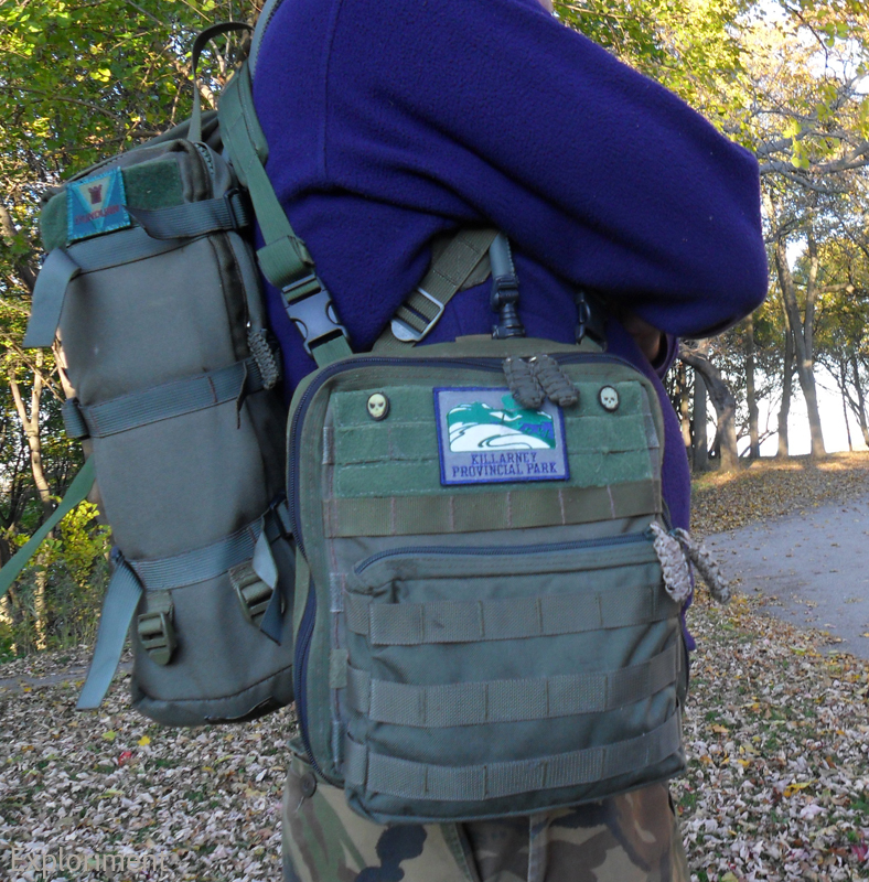
Map’mups
I’ve shown my earlier attempt at a map case. It worked okay, but going into it I knew it would be a stop gap measure to tide me over. I already had the plans for something considerably more elaborate worked out in my head. And this is it.

The design of this was driven primarily by canoeing, although being on foot or on bike was another scenario I envisioned it for. When in a canoe, on a large windswept lake and I need to do a map check, I want to be able to do that quickly and with little fuss. Same with things like getting an oft needed piece of equipment out – compass, GPS, binoculars, camera, radio. I’ve tried having things on a belt, but when seated, as in a canoe or kayak, it’s both uncomfortable and hard to access stuff. Up on the chest is a better spot for it.

There are similar items out there, HSGI’s admin panel being one, OSOE’s NSW admin panel being somewhat similar. My issue is that I use maps that I’ve printed out and laminated at a size of 8½" x 8½". Considerably bigger than what anyone is offering.

5 rows of PALS and 6 channels wide. About 10" x 10" all told. It’s big.

PALS on the back would have been overkill, and I couldn’t put any on the sides due to the zipper. What I could do, and what works very nicely is the Thomas’ Attachable Bag System, or TABS for short. It allows me to clip in side release buckles, siamese clips or anything else that works.

So far I’ve used the Kifaru shoulder straps that you can get for the Tailgunners or that come with the Scout. Works like it’s made for it. The two front male buckles jack into the two female buckles in the top corner tabs, and the two back male buckles jack into the bottom side female buckles.

At other times I’ve used the Kifaru shoulder strap, and carried it slung over one shoulder.
I can also clip it into buckles that I place on the shoulder straps of a pack.
I can also clip it into buckles that I place on the shoulder straps of a pack.


I can also mount the Map’mups on the face of a pack when I’m in transit.


With the Prune’mups, Saw’mups, Leatherman Wave and Camer’mups.


Bottom with drain hole. I put PALS webbing on here (as well as the corresponding part on the inside) not because I had any real purpose for it, but I figured what the hell. I may at some point find a pouch or something to stick there.


Along the back on the inside, behind the PALS webbing is a pocket that houses extra maps, note pads, guide books, etc. On top of that sit five 12½ cm (5") deep pockets - four that are about 8 cm (3") wide, and one that is 16 cm (6") wide. One of them has four slots for pens. These are for a note pads, a fresnel lens, map tools, protractors, a roller ruler, etc. Along the back are also four 550 cord loops, two on the top and two on the bottom, for tying dummy cords to.

Along the top at the back is also a Velcro strip for patches. Ones that are rotated out can be stored there.


Behind the map case is another slot pocket for storing extra maps. The map case itself can hold about a dozen maps, so the two extra slot pockets are great for the overflow.

The map case itself was something I wasn’t completely certain about. I used vinyl from a portfolio page. I don’t know how it may be different from the clear vinyl in other admin panels and the like. In the back of my head was the idea that it might not be as strong. For that reason I opted to make it removable. If for some reason there’s a problem with it, it will be easier to repair or replace that way. Another idea I had was to make a separate module for actually doing mapping. A thin board with bungee cord at the four corners to hold the paper down. Velcro on the back just like on the map case, so that it could then be popped in if the purpose is to go out and notate information. (shortly after I finished this I saw that CPGear had come out with their own take on this and saw that theirs featured a removable map window. Maybe my idea wasn’t such a compromise after all.)


The map case opens at the top with a zipper.

At the top corners are two tabs with grommets for the 550 cord to keep the front from flopping right down.


Oh and wait for it – drum roll please – the whole thing was done by hand.

The only things that I think are weak areas are the fact that with the weight of the pouches on the front, when opened it tends to sag a bit. Not majorly, but it does droop a bit. Also the zippers and the webbing they’re sewn to tend to puff out at the sides a bit. That’s not really a big deal though, just a bit of a cosmetic thing.
So now that I have this done, I’ve already got a whole new design floating around in my head. Taking some of the ideas from this, and then taking it in a whole other direction. Part of it is realizing that I could have done certain things an alternate way construction wise, and also just some very different ideas about how to approach the problem design wise. And that is all part of the fun. Designing it, making it, trialling it, and then making a good thing even better.
Subscribe to:
Posts (Atom)


