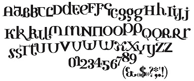
This is one of two ‘amalgamation’ fonts I did. Some of my early experimenting with type consisted of playing with forms – taking typefaces apart and putting them back together again. In the early 90’s I would disassemble Times, Garamond and Bodoni and a few sans serifs (I didn’t have access to much more) and reassemble them. I constructed four typefaces this way, and also several logos. I knew full well their limitations, but a few characters continued to appeal to me. I decided to boil down what I had done into one typeface, redrew every character, added uniform serifs. It certainly doesn’t work as a cohesive typeface, and it’s not necessarily meant to, but it can work sometimes for certain applications. If the letters work together for a specific word, I’ve used it for logos, headlines in magazines, etc. I did this in 95.
Subscribe to:
Post Comments (Atom)


No comments:
Post a Comment