Showing posts with label Adobe Illustrator. Show all posts

Sunday, 11 December 2016

Auto Trace Sucks

I’ve been using vector drawing programs for almost 30 years. Turning a scanned image (aka a raster or bitmap image) into a vector drawing (aka a line drawing) has always been a laborious task. When Adobe released Streamline in 1989, I was excited at the possibilities it opened up. But I was sorely disappointed with the results. Over the ensuing 25+ years, I figured the technology would improve. I’m still as sorely disappointed today as I was all those years ago. It’s still a computer algorithm that tries to deduce what should happen - and gives you a RIP clogging mess of random points, and weirdly contoured lines. You spend more time trying to fix the resulting mess than you would if you just traced it yourself. Sure, the results can give you a crude effect - which may be fine if that’s what you’re after. But if you want precision – which, since I’ve been told I’m a persnickety control freak, is definitely the case – doing it by hand, carefully placing points and controlling the nodes, is the way to go. There are online programs - Vector Magic is one - but they all produce the same slop.

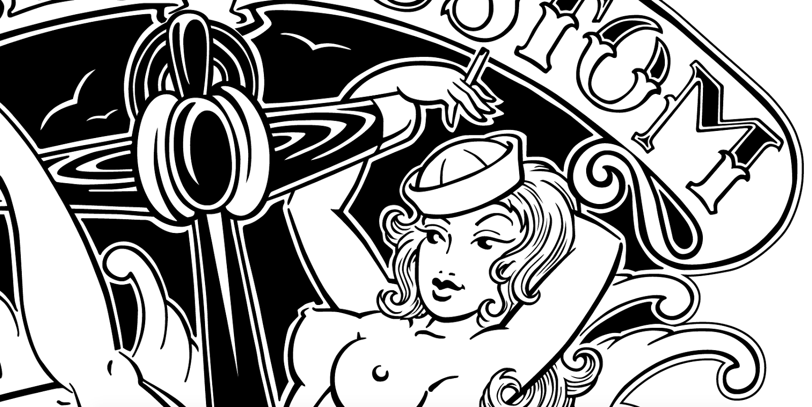
I recently turned a drawing Mike Austin did years ago into vector file. Took a kooky amount of time – and I see all sorts of things I want to tweak – but I wanted to use it as an opportunity to show how lacklustre the results are.
A crop of the original that I was sent.
My effort.
The setting used was Illustrator’s “Black & White Logo”. Her hair and the lettering are obvious examples of the inaccurate results created.
“Line Art.”
“Technical Drawing.”
“High Fidelity Photo.”
What that looks like in wire frame mode. Nothing a plotter could ever handle. Image setters would have started belching smoke if you tried to print that, back when I started in this field.

Sunday, 21 February 2016

Polygonal Portrait: Anand

Okay, last one of these I do for quite a while. Quite possibly ever. First one was 1000 triangles. Second one was 4000 triangles. This one was over 13,000 triangles. There isn’t that flow you get with painting or drawing. This is just mindless bezier point clicking, hours and hours and hours of it. Why do I do this to myself? I think the next illustration style I’ll explore will be stick figures.
The end result.
The original.
Cropped from this image. He’s about 2¾ here. At the sand mandala the Tibetan monks did. With Tenzin, their interpreter. Happy memories of a really fun day. (It was the day they did their opening ceremony. I had taken the day off work, since this was something of a once in a life time experience. We tried to impress upon him to be quiet while it was going on. Being a squidgy toddler, he crawled from lap to lap. At one point he sat on our friend Jen’s lap. She’s pregnant. He’s touching her boobs. He whispers “Your boobies are really big auntie Jen.” I think all of us hurt ourselves trying to not burst into gales of laughter.)
Keyline view. The end result was 13109 objects, 41270 points, 83.25 meters worth of line. And an almost silly number of hours. 80, 100. Now that it’s done, I’m kind of indifferent about it.
Some close-ups.

Sunday, 31 January 2016

Polygonal Portrait: Roxann

I’ve been doing some over photo illustration, using just triangles. Time consuming, fairly tedious, but I like the results.

And even though I’ve used Illustrator for almost 30 years, I learned a few new tricks doing this. Namely a way to find out how many elements are in use, and a way to quickly and easily close any paths that might not be closed.

The lovely Roxann:

The result.
The original.
The process. 4249 triangles, 13,144 points. Somewhere between 30 and 40 hours of work.

Friday, 29 January 2016

Polygonal Portrait: Thomas

I’ve been doing some over photo illustration, using just triangles. Time consuming, fairly tedious, but I like the results.

Sunday, 3 August 2014

The Adobe Illustrator Story

Heaven knows I have some issues with Adobe Illustrator, but I use it and I have been for a long time. It may not be my favourite vector illustration program, but it was good to see this glimpse into the birth of it. Funny to look back on what are now positively quaint images of computer ads from 25 years ago.

Sunday, 10 November 2013

Left Forearm Tattoo

I’ve shown two pieces I’ve created in the last few days for my right forearm. The front and the back which will then be filled in from there.

Now, I also have a drawing in a similar vein for the left forearm, also based around the idea of spirals and foliage. Sadly, I did this drawing a bunch of years ago, and I am still waiting for that goddamn Jarkko up in Kincardine, Ontario to do it. Damn him!

I took these photos back when I completed this drawing and taped the paper printout to my arm, again to ascertain if everything went where I wanted it to.

Saturday, 9 November 2013

Back of Right Forearm Tattoo

In conjunction with the one I created for the front of my right forearm, here is one for the back. Just seeing if everything goes where it’s supposed to. The spiral on the bump on the outside of the wrist (I believe it’s the ulnar styloid process) needs to be modified a bit. Made tighter and smaller. I’ll likely work out the stuff that goes between the two sections afterwards.

Thursday, 7 November 2013

Front of Right Forearm Tattoo

Piece I’ve drawn for the front of my right forearm. Just seeing if everything goes where it’s supposed to. Working on the piece for the back of my right forearm. And from there I’ll figure out the rest.

Tuesday, 12 June 2012

Maninjau Travel Poster

Going through a bunch of USB keys, I ran across this poster I did recently while in school. Had to do a travel poster for an assignment. Didn’t want to spend too much time on it, but had some fun with it any way. Decided to run a few photos through LiveTrace and combine some elements. I’ve never been a fan of any of the auto trace features in illustration programs – they never prodce results I consider satisfactory. Whether it be Adobe’s Streamline or Illustrator’s LiveTrace, the results are always the random results of a computer algorithm. They’re better than they used to be, but still leave me underwhelmed. If this had been an actual paying gig I would have lavished far more attention on it, but this was fine to demonstrate a concept.

Wednesday, 8 February 2012

Roarshacks

This idea came to me in a dream last night. Figured it was an idea worth exploring at the very least.

Friday, 27 January 2012

Sun & Moon

Been noodling around with this idea off and on for ages. I intended it as a logo. Played around with it a bit here and there yesterday and today, and I think it’s all right. Not really very suitable as a logo any more though. Lots of fun to do anyway.

Friday, 30 September 2011

Vampire Babe

I rarely do any illustration, but I have been trying to discipline myself to do it more. I’ve been meaning to do an illustration for a halloween party invite. I have a vision of what I want in my head, and I tried my hand at it today. Turned out better than I could have hoped for. I was trying to achieve a fog effect, which didn’t really turn out as well, but this is only a rough first draft. Lots more to do. Fun. The ability to achieve gradients, transparency, layering, etc.  makes Illustrator a really fun tool. Well...Freehand would be even better of course, but I’ll take what I can get.
Did a little more today. Lots more to do, but really enjoying it so far. Hands are hard.

Tuesday, 26 April 2011

Typeface Design – Siegfried

Mmmhh, design may be a bit of a misnomer – production may be more appropriate.

Along with Freddy, this was commisioned by PostContemporary Records for use on one of their Zeuxis and the Painted Grapes releases.

The example they had was from a Morgan Press Type Collection Catalog. In the sixties there was a big revival of turn of the century, art deco faces, and that is indeed the era this is from. Released in 1900 by the Wilhelm Woellmer Schriftgießerei in Berlin.
If you totally love this typeface, you can get it free from here and here. Don’t know if they’re the same, and I seriously doubt that it’s the one I did. But if you want it, go there. (Maybe my version is better, but I don’t even know where I have an actual typeface copy of it (never thought enough of it to actually use it myself). I know I have a .fog file somewhere, but without Fontographer, there’s not much I can do with it at the moment.)

Thursday, 14 April 2011

Smokey Skull

Another sketch by Andrew Little that I vectorized.
 It was done originally as white pencil on black board.
Silk screened on to a few different garments.

Tuesday, 12 April 2011

I ♥ FreeHand

I don’t purport to be an expert at much of anything. But I have to very immodestly claim expertise at vector drawing and the software that facilitates it. If there is one thing I have done more than most, it’s manipulating bezier curve points. I’ve used pretty much everything out there, starting in 1988. An early version of Deneba (now ACDSee) Canvas. Altsys (now FontLab) Fontographer from v. 1.0 onwards. Adobe Illustrator from v. 1.0 onwards. Aldus/Macromedia Freehand from v. 1.0 onwards. FontLab Studio 5.02. CorelDraw from v. 8 onwards. I’ve even noodled around a little with Aviary Raven. In addition to that I’ve also dabbled in CAD software like SolidWorks and Google Sketchup.

If Malcolm Gladwell is correct that to be an expert at something you have to devote at least 10,000 hours to it, I have earned my expert badge many times over as far as bezier/vector drawing is concerned.
Early in my career I worked at a small to medium sized printer that tackled loads of different things. We had both PageMaker and FreeHand. The computer when I got there was a Mac SE with a 20MB hard disc and the only backup medium was the floppy disc. Pagemaker, just to start an 8.5x11 page, created a 75k file. The same blank page in FreeHand created a 5K file. As soon as you began importing .eps files into PageMaker (which never displayed satisfactorily) the file would balloon in size. The logo in FH was tiny. Turn it into an .eps file and it grew huge; place that .eps into a PM document and it grew exponentially bigger. PM files were sometimes so large that they needed to be split across several floppy discs. In FreeHand I could simply copy and paste the logo into the business card, brochure, poster, what have you, it would look fine, and do everything else I needed to do. Text controls were robust. The only thing it missed was a spell checker. Since I’m a human dictionary, I didn’t mind that. I would always get someone to double check what I had done anyway, so I wasn’t too worried. Plus, and this was rather important in those early days of DTP, I ended up with a file that was relatively tiny. Under a hundred K, rather than the many hundreds, thousands of Ks for PM files. I could often put everything – logo, and all the collateral done with that logo – on a single floppy disc, as opposed to trying to spread even one file across several floppies. Which would then sometimes not reassemble properly when you put them back on the hard disc. Not to mention, why even deal with the nuisance of two separate programs and having to export files between them, when it could all be done in one program? Unless I was doing a book, or a catalogue, or a magazine, I saw absolutely no reason at all to deal with the less elegant and frankly less fun Pagemaker.
As I later worked with more powerful computers with larger hard discs and larger storage mediums, I still saw no reason to diddle around with PageMaker or Quark XPress. Again, unless it was a massive multipage document that required pagination or indexing, I saw no reason to not work in Aldus FreeHand.
So as far as I was concerned, FreeHand allowed me to be much more productive than PageMaker, or Quark XPress. So how did it stack up against the other powerhouse vector software, Adobe’s Illustrator? I tried Illustrator. I hated it. It was unnecessarily complicated and lacked the intuitive ease, precision and versatility of FreeHand. I kept forcing myself to use Illustrator, since I figured it would be good for me to be proficient with both. But I just could not force myself to actually enjoy that shit sandwich. The basic core of it, the way it handled bezier curve points was frankly, terrible. Only a pen tool, and a different tool to manipulate the control handles, and different tools to add or remove points, and different tools to handle the lines or select the control points. Joining points was idiotic. I was often swearing like a drunken sailor as I tried to use this maddening clunker. There is a reason I call it Frustrator or Ill-luckstrator. How the hell did this moronic interface ever allow Illustrator to gain any sort of market prominence at all? FreeHand was always a breath of fresh air. I could get the same job done in a fraction of the time, everything flowed smoothly, and it was just plain fun. Like a determined athlete that wanted to win, I kept forcing myself to get back at it despite the pain. I became familiar enough with Illustrator that I could show up at a new job and know what I was doing. But goddamn did I loathe that program. It was awkward, counter productive, the work flow in it felt like I was swimming in molasses... FreeHand was so clearly superior that I wonder how Illustrator managed to survive at all. How the hell had this program managed to bamboozle anyone into using it? People, through not knowing any better, bought AI, and not being made of money, were unable to buy anything else, so they had to suffer through it. If anyone had the resources to acquire both AI and FH, I suspect that FH would have trounced AI resoundingly. FH was simply a vastly superior program, outshining its competition in almost every way. It offered text on a path and layers long before AI did. I think it wasn’t until AI v. 3.0 that you could even do anything in colour. Many other features. Oh yeah, and then there was the fact that FH’s core functionality was so much better.
FreeHand allowed me to do just about everything I needed to do. I could create custom typefaces, draw a logo, do an illustration, design a poster, create any ancillary items meant to accompany that poster - tickets, maps, stationery, booklets, etc., all in one program. There was often little need for me to switch to any thing else. FH wasn’t limited to doing just drawings – it was an absolute powerhouse that suited the way I worked perfectly. What I liked about it so much is that it took a backseat and just let me create. I wasn’t struggling with an abysmal interface. The core of what it did, vector drawing and type handling were simple and powerful. It was user-friendly, logical, intuitive. I sang FH’s praises to anyone that would listen.
In 1993, I came back from a trip to Asia and heard that Adobe had bought Aldus. Oh no. Adobe has Illustrator, Aldus has FreeHand – what would happen to FreeHand? Would they bury it in favour of the inferior Illustrator? Fortunately, they were obliged by US antitrust legislation to divest themselves of FreeHand so that there wouldn’t be a monopoly on vector graphics software. This is how Macromedia came to own FreeHand. Later, when Adobe bought Macromedia, that same legislation wasn’t brought to bear. Truly, a tragedy.
When Adobe merged with Macromedia, many wondered what would happen to FreeHand. Did Adobe even realize what a gem they had in this versatile program? They continued to sell it, but they didn’t do anything to upgrade it. In May of 2007 Adobe finally admitted that they had killed FreeHand. They would no longer update or patch FreeHand for new operating systems or hardware (such as Intel Macs). Adobe created several migration guides to help long-time FreeHand users move over to Adobe Illustrator instead. Which really wouldn’t be anywhere near satisfactory.
Speaking with other people who were experienced with both programs, the same phrases kept coming up. FreeHand – simple, intuitive, quick, powerful, efficient. Illustrator – frustrating, complicated, awkward, confusing, clunky.
Some of the features that made FreeHand so great. This touches on a number of versions over many years. Some of the features were eventually adopted by Illustrator. Some have never been adopted.
Layer Control – Less complex to use and easier to select/de-select and move objects to and from.
Dynamic Palettes – I select a line and the stroke and fill options appear. I select some copy and the text options appear. Of course! The info and tools I require are always in the same place. I don’t have to search for a new palette – very intuitive, less clutter.
Cloning Objects – one keyboard shortcut rather than two. This is merely one example of many things that could be achieved in one step rather two or three in Illustrator. This may sound trivial, but it starts to add up over time.
Knife Tool – ability to slice over a bunch of lines and cut everything in one go.
Joining Paths – a breath of fresh air compared to AI.
Multiple Pages in One Document – not just multiple pages, but each in any size or format desired. Multi-page documents with linked columns, obviating the need for a program such as Pagemaker or InDesign or Quark Xpress.
Lock/Unlock – lock and unlock individual objects, not unlock all like AI.
Paste Inside Command - way better than AIs Clipping Paths
Text Handling – always better in FH. I could use tab features for instance.
Radial Gradation – were always smoother in FH versus AI.
Punch and Union – way better than PathFinder.
Collect For Output – quickly gather up all the elements used when it came time to send the file to a service bureau.
Name All Colors – made colour swapping very easy.
Find & Replace Graphics – amazingly powerful tool. The ability to alter all the stroke widths or colours in a document in one fell swoop - huge time saver!
Corner, Curve and Connector Points – ideal for drawing.
Bezigon Tool – yet another option for drawing that AI didn’t offer.
Rectangle, Oval and Polygon Tools – much better than in AI. Adjustable curved corner - great feature!
Editable Blends
Page Tool
Perspective Grid
Spiral Tool
Power Duplicate

There were so many other things – efficient selection methods, text attached to top and bottom of circular paths, well implemented point alignment and snapping controls, flowing text inside paths or around shapes, customizing toolbars, working with colour and gradients was always easier, being able to colourize tiffs, reliable film output, amazingly accurate point alignment.

And then we get back to the point I keep hammering on about, the very essence of what a vector program is supposed to do. Namely placing and manipulating points, which was infinitely easier in FreeHand, rather than a frustrating exercise like it is in Illustrator.
Another thing that always annoyed the hell out of me is that FreeHand allowed you to export many more file formats. Including exporting Illustrator formats. Illustrator on the other hand would not export Freehand formats – which always struck me as utter petulance on Adobe’s part. Yeah, there is another program out there, one that happens to be better than your offering, and refusing to concede that fact isn’t going to make it go away. Oh right, but you can buy it and make it go away. Assholes.
There are things I like about Illustrator: 3D Effects, Live Paint, Open Type support, Make Warp presets, Brush tools, Live Trace, Lens Flare tool, Mesh tool, Opacity masks, PDF output, and great consistency and nearly seamless integration between the other CS apps.
And there are certainly drawbacks that FreeHand had at various points. (No program is ever perfect.)
PDF export in general was kinda lousy.
OpenType and UniCode wasn’t supported.
Freehand wasn’t Postscript level 3 compliant for quite some time. Meaning that only 256 levels of grey were produced rather than say a gradient with 4096 levels of grey, which PS Level 3 allowed.
Pattern fills and strokes could not be output to high-resolution devices.
When making a PDF of a FH document with a 2 spot colour linear gradient using Adobe Distiller, while the other elements appear in their spot colours, the gradient came out in CMYK.
Text that had been underlined, when converted to paths, would lose the underline.
A high resolution PDF generated from a FH11 document with a spot channel EPS DCS 2 as a composite, spot colours would disappear and convert to a low rez 4 colour.
FH 11 lost information (strokes would disappear) when ungrouping objects.
Freehands transparency effects did not work well. A grey-scale scan made transparent, became a bit-map with all the grey gone.

But a lot of the latter ones were somewhat obscure flaws. Some of these things were conflicts that only become apparent in the crucible of a production environment. Just plain awkward vector tools with crappy anchor point and handles controls is something that should be apparent right from the get go.

And the flaws of the later versions showed signs of Adobe allowing their acquisition to stagnate and not bothering to update or amend flaws.
Admittedly both programs have had bad versions in the past: FreeHand 4 and 10 and Illustrator 7, for example. Not all so-called ‘upgrades’ are improvements; often the interface gets worse and the software becomes increasingly bloated. What users never want (but what the big software firms are always giving us) are more and more functions patched on, meaning more bugs and conflicts, and a bigger and slower program.

I realize that all software has its strengths and weaknesses. Some will say that Illustrator and FreeHand are just vector illustration tools utilizing anchor points and paths, with the ability to change the attributes of these vector objects’ fills and strokes. But strip away the filters and effects from AI and what you end up with in my opinion are abysmal vector tools with crappy anchor point and handles controls.

In the last decade I’ve been forced to use Illustrator since it’s often all I have access to, and I’ve sucked it up and gotten more proficient at it. If it’s the difference between getting an idea out of my head or not, well...I guess I’ll eat that shit sandwich. But I don’t have to like it. The whole time I realize that something exists which would be faster and more fun. I would still happily take FH 7 or 5.5 or even 1991’s 3.1 over the latest version of AI. How’s them apples?

If Adobe was to come to its senses and resurrect Freehand, or allow someone to resurrect it, some features I’d like to see include:
Proper PDF engine, with an ability to import and export PDFs
Adobe type engine, with support for OpenType, UniCode, font grouping, optical kerning etc
Support for SVG
A history panel would be great.

There is now an organization dedicated to spreading the word about FreeHand, http://www.freefreehand.org/. Trying either to get Adobe to revive it, get them to sell it to someone who will do something with it, or release it as open source software.

I don’t know the first thing about programming. I’m merely an end user of programs. But I feel so passionately about this, that if somehow someone is able to wrest control of FreeHand away from Adobe and turn it into an open source project, I want to learn about programming so that I can contribute in some small way to that most worthy project. FreeHand was (and in so many ways continues to be) such a vastly superior program, I want to help get it out there again. The more I learn about open source projects, the more I like it. I realize open source has its flaws, but a monopolistic software giant that refuses to listen to the pleas of a huge user base, and buries a better product, doesn’t have flaws? FreeHand deserves better than to be bled to death by a company who looks at this as another victory over its competition.

Even if it was just a simple stand alone drawing program, that used FHs beautiful tools, (maybe at the level of v. 5.5 or so) that would be fine with me. Do all the drawing I need to do, and then take that into Illustrator. Anything to avoid the aggravation of having to use AIs drawing tools.