skip to main |
skip to sidebar
I generally refuse to take on anything that I’m asked to do. (I’ve been inundated with people asking me to do custom patches for them. Not interested. It’s fun when I do an unbidden one as a gift for a friend, but the “can you make shirts and hats for my entire softball team” questions got to be a little silly. I do this as a fun hobby. I really haven’t the means to do this on a scale other than that.)
But a lady at my work has a developmentally challenged son who has a thing for dragons. I made an exception in her case when she asked me. And I’m really pleased with how it turned out.
Not sure I’m quite as enamored of Apple as I was 30 years ago, but their computers have played an important role in my life for that whole time.
(For part 1, look here.)
I stopped making patches for a while, because I was busy doing other things, and it started to frustrate me a bit too much. Mainly the interchange between my Illustrator file and what the embroidery software spat out. All sorts of oddities were generated, and trying to correct them was just too time consuming.
Took it up again a few weeks ago. I still get some weirdness occasionally when I convert to an embroidery file. But I’ve learned some ways to work around it. I also try to forego filling an entire background with embroidery, rather letting the background show through. I’ve also realized the old tattoo adage of “bold will hold” is a good one to follow. I generally do pretty iconic images, and try to avoid cutting out really complex shapes. I’ve also learned that a file for printing and a file for embroidery are two very different things. I’m still just using scraps of 420D nylon. Not sure if that’s the recommended material, but I have loads of it, and it seems to work okay.

Ourobouros.
Canoehead, or more properly, the portage sign. I still don’t have the means of merrowing the edge, so I still cheat by doing a satin line around the edge, cut very close, singe then ends with a lighter, and then colour the edge with a marker or acrylic paint. Adapt. Improvise. Overcome.
Death’s Head Moth.
A name tape for myself, using one of my typeface designs. (Which I realized I did 25 years ago. Yikes. Where does the time go?)
And my logo as a patch.
Here you can see looping stitches that occur some times. I just cut them away and singe them. Not sure what causes it or how to prevent it.
Two different apertures. (The top one shows an anomaly that occurs sometimes; the bobbin thread showing through. Nothing a black marker can’t fix though.)
This might be a good time to show some of the glitches generated by the embroidery software.
This is what you see when you first convert your file. (This is Janome’s Digitizer software.)
Go to “TrueView” and this shows. Huh?
Zoom in. No rhyme or reason for it.
My high tech fix? Flip the image in Illustrator, and it shows up just fine. Huh? Like I said, no rhyme or reason to it.
I’ve spent 30 years off and on as a graphic artist and pre-press tech, so I wanted a CMYK crosshairs.
Still have to finish the edges. Tatami in the quadrants, satin for the ring and crosshairs.
In the yellow quadrant you can see what happens a fair bit on curves. It forms the outer ring by first drawing an outline and then going back and forth over that. For whatever reason, there’s a section that isn’t covered. Don’t know if the embroidery of the four tatami sections changes the tension of the fabric that much, if there is slack in the fabric, if it’s a structural flaw in the embroidery file... Not sure.
Did one with the “Satin” setting (on the left), and one with the “3D Satin” setting (on the right). The first was 4629 stitches, and the other was 13445 stitches.
Predacon logo for a friend. Thought I’d try it with variegated thread.
A S.T.A.L.K.E.R. PMC faction subdued patch for a friend.
Crummy old one I did a few months ago on the right, new and improved one on the left. The old RCAF roundel.
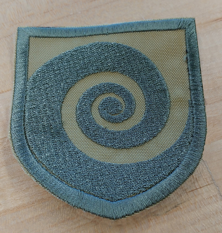
Spiraloctotentacle.
As a type dork, one of my favourite characters is the Ampersand. This one is from a House Industries T-shirt that I wore to destruction. Will probably get another one at some point, but stole the design for a patch for myself. Sorry House.
An old Mac icon.
First attempt at a Technics turntable patch. Too small, and all the dots on the side of the platter blaed together.
Really thick lettering. Not good.
Attempt # 2. Larger, and I made the dots and type smaller, to compensate for the bleed that occurs. You can see how much curl there is on the first one.
Sigil of Baphomet for a friend.
And sorry to all you religious people that I’m making you look at this again, but it demonstrates a point. You can see the colours here do not match the above image in the slightest. The reason I do that is that the screen that comes up on the embroidery machine itself is tiny, and doesn’t give a great representation of the colours. Especially if the colours are in any way similar (two reds and an orange, say), it’s really hard to distinguish between them. Giving them bright, contrasting colours makes it easier to figure out which is which. I can put whatever colour of thread I want on there, and this just makes it a bit easier to figure out on the screen.
Some Star Wars patches I made for a friend.
It’s true. I do.
Another example of the oddball, “why you do that!” things the embroidery software does. Go into Illustrator, flip the image, flip the I ♥ LEGO back, import it again and ... weird fill is gone. Makes no sense.
On the left is an attempt from about a half year ago. I tried a smaller one 4 up in the hoop and then I tried a larger one 1up in the hoop. I got that misalignment at the top right of the O and the bottom left of the L on both. I managed to cheat and black the area in with a marker, because gosh darnit, I really wanted a Lego patch. Tried it again, this time with some red material rather than trying to fill in a whole background. Much better this time.
Some more inexplicable weirdness. I created this file in Illustrator, and yet when I brought it in to Janome’s Designer, it assigned a tatami fill to the L, and satin to the E, G, and O.
Looking closer, you can see that the area behind the L is knocked out, but not for the E, G, and O. Huh? Went in, and I managed to remove that area behind the L so that there was now a solid black and changed the L to be satin as well.
Wookie.
I doubt I’ll ever stop finding the Golden Ratio fascinating.
Ryan Adams for a friend.
Hard to tell from the photo, but the patch is the same size as my beloved Swiss Army Knife. (A Huntsman I’ve had for 25 years in case you’re curious.)
View-Master reel.
Glock patch for a friend. I’ll make one for myself to antagonize the hippies.
Huge part of the Canadian cultural landscape. Fond memories of being a kid fresh in Canada, the lights in the classroom dimming, the whirr of the projector starting up and the magical images projecting across the screen. Classics like Helicopter Canada and Paddle to the Sea (along with other Bill Mason films) helped shape my perceptions of this new to me land.
(And as an interesting aside, the name “Boards of Canada” took their name from this very organization. As kids who spent part of their childhood in Canada, they too were very inspired by NFB films.)