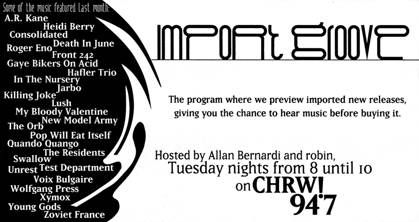
2 ads for a radio show done for the local weekly alt-media magazine.
Showing posts with label Drone. Show all posts
Tuesday, 19 February 2013
Tuesday, 26 April 2011
Typeface Design – Siegfried
Mmmhh, design may be a bit of a misnomer – production may be more appropriate.
Along with Freddy, this was commisioned by PostContemporary Records for use on one of their Zeuxis and the Painted Grapes releases.
The example they had was from a Morgan Press Type Collection Catalog. In the sixties there was a big revival of turn of the century, art deco faces, and that is indeed the era this is from. Released in 1900 by the Wilhelm Woellmer Schriftgießerei in Berlin.
If you totally love this typeface, you can get it free from here and here. Don’t know if they’re the same, and I seriously doubt that it’s the one I did. But if you want it, go there. (Maybe my version is better, but I don’t even know where I have an actual typeface copy of it (never thought enough of it to actually use it myself). I know I have a .fog file somewhere, but without Fontographer, there’s not much I can do with it at the moment.)
Along with Freddy, this was commisioned by PostContemporary Records for use on one of their Zeuxis and the Painted Grapes releases.
The example they had was from a Morgan Press Type Collection Catalog. In the sixties there was a big revival of turn of the century, art deco faces, and that is indeed the era this is from. Released in 1900 by the Wilhelm Woellmer Schriftgießerei in Berlin.

Friday, 24 December 2010
Friday, 23 July 2010
Typeface Design – Ampersandman
Just a fun, experimental typeface I jotted off in an afternoon, back in 95. I’d been a big fan of Sandman right from the first issue, and my favourite character in the alphabet is the ampersand. I took a bunch of ampersands from various typefaces, tore them apart, and rebuilt them into this. Pretty much a throw away thing. Probably just a few hours of playing around, distraction from something more serious.
Wednesday, 7 July 2010
Typeface Design – Arcane
I did this one back in 92, quite specifically for a poster. Done with the side bearings set to zero, so that it would create more texture than type. Different X heights and letter widths contributed to that. It was meant more to create a background than proper text. A big part of what inspired it was the weird globs of text I would see on the screen in PageMaker. This was before TrueType or ATM or anything like that. All there was were screen fonts and some of those were just a mess. But, oddly, that aesthetic appealed to me in a way.
Wednesday, 23 June 2010
Logo – Drone
Saturday, 19 June 2010
Thursday, 8 April 2010
Typeface Design – Mau Gothic
I was approached by Bruce Mau Design to create a bold weight of W A Dwiggins’ Gothic.
They were creating the graphics for a major exhibition at the Art Gallery of Ontario called Oh! Canada. Chris Rowat, the art director on the project, found that applying bold in Quark was entirely unsatisfactory. The spacing and kerning ended up looking hideous, and some characters were more problematic than others. The m, n, and u had too little white space in them, the $ had almost no counters, the bar on the G bumped into the left hand stem, and the swash on the Q presented similar problems.
Applying the “Change Weight” command in Fontographer proved to be only marginally better. While it was acceptable as a starting point, many features needed to be altered and corrected. With a face as condensed as this, the areas in the counters proved to be the biggest cause for concern. Since this face was going to be read on screen as well as on paper, I had to be doubly aware of this fact. Much of what I did consisted of expanding them (a percentage point or two at most) and entirely redrawing certain letters to be slightly wider – the m, n, and u, and G and Q. I added ink traps in characters like the M, N, V, W, X, Y, v, w, x, y. The stem in the $ was angled slightly, and the counters redrawn so that they at least showed. The angles in the K, M, N, R, and k were skewed slightly to increase the white space. Other finicky little things like the space between the double quotation marks were attended to. A small number of missing characters were created, and finally, unhappy with the way the original was spaced, I respaced and kerned the whole thing.
Friday, 2 April 2010
Typeface Design – Lucifah
Typeface done for lettering a comic book. There are other hand lettering typefaces out there that I could have bought, but invariably I don’t have the money, and besides, this gives me the satisfaction of having created it myself.
Thursday, 25 March 2010
Kilos of Keen K’s
A self promo piece I did. Every letter on this poster was created by me. Taken from typefaces, logos, headlines, and experiments.
Gazilions of Groovy G’s
A self promo piece I did. Every letter on this poster was created by me. Taken from typefaces, logos, headlines, and experiments.
An Abundance of Above Average A’s
A self promo piece I did. Every letter on this poster was created by me. Taken from typefaces, logos, headlines, and experiments.
Tuesday, 16 March 2010
Typeface Design – Lucas
I wanted to tackle an idea I had for a sans serif typeface with a wide axis. A wider face is just easier to read in passages of text, because its shape follows the movement of the eye. Took me about two years of off and on work on this to complete it. I’m rather proud of it. It’s not so fancy, but it works well, and it’s my own. Named after my father.
Friday, 19 February 2010
Typeface Design – Amsterdam
My initial forays into type consisted of hacking Letraset, distorting it on photocopiers, playing around with it on stat cameras, then adding to that with tech pens, etc. Then in early 88 I started drawing type on the computer. I was doing fanzines, gig posters, logos, tape covers, etc. and I knew instinctively that I wanted to use typefaces other than the ones I had at my disposal. My choices at the time were very limited, and nothing I had access to accurately conveyed the look I thought would be appropriate for say an experimental electronic combo.
So I started drawing my own typefaces.
Now in those days I had access to a 512K Mac. Not much computing power. After that I got my hands on a Mac with 2MB of RAM and a 20MB hard disc. Still not that much computing power. To facilitate production, the stuff I drew was fairly simplistic. Being able to step and repeat elements made life simpler. I didn’t have any pretenses that I was able to create complex calligraphic scripts, and these early orthogonal typefaces were a good starting point. They gave me something that could give my graphic design a distinctive look.
Amsterdam is a compendium of early experiments. I had about 9 completed geometric typefaces, some incomplete ideas and figured one like this was enough. Took what I liked out of them, and also culled some stuff I had done for logos and headlines. Quite deliberately I went for a look that wasn’t so harmonious. I turned it onto a monocase, added a few missing elements, and created the different weights and variants. This was done in 93.
Wednesday, 17 February 2010
Typeface Design – Freddy
Well, maybe this isn’t so much “design” as it is straight production work. Post Contemporary Records had come to me asking me to create a digital version of a typeface called Freddy, a 1960’s era Morgan Press face, which I suspect is itself a version of an art deco era face.
I decided to try Adobe’s Streamline, their auto-trace program. I hadn’t been very impressed with the auto-trace features on FreeHand, but thought I’d give Streamline a shot.
And it stunk too. The problem with letting a computer algorithm do it is that it places points in really wonky places, and leaves a wobbly, ugly line. I spent so much time cleaning up the lines that I realized I may as well have just traced it myself with the pen tool, getting it perfect the first time. Lesson learned. And auto-trace features still suck all these years later. I can always tell immediately when someone has auto-traced something as the lines are so sloppy. Which can definitely look good in certain instances. But for the stuff that I’ve done and continue to do, I need the lines to be much tighter and precise.
I decided to try Adobe’s Streamline, their auto-trace program. I hadn’t been very impressed with the auto-trace features on FreeHand, but thought I’d give Streamline a shot.
And it stunk too. The problem with letting a computer algorithm do it is that it places points in really wonky places, and leaves a wobbly, ugly line. I spent so much time cleaning up the lines that I realized I may as well have just traced it myself with the pen tool, getting it perfect the first time. Lesson learned. And auto-trace features still suck all these years later. I can always tell immediately when someone has auto-traced something as the lines are so sloppy. Which can definitely look good in certain instances. But for the stuff that I’ve done and continue to do, I need the lines to be much tighter and precise.
Tuesday, 2 February 2010
Typeface Design – Thornaments
When FreeHand 3 came out, one of the new features was a blend command. I had the cheeky idea to try blending two of the most ubiquitous typefaces, Helvetica and Times New Roman together. Nothing spectacular, but kind of fun nonetheless. I did one where I would pick (as close as possible) a point on corresponding sides. Top left point to top left point, etc. This one came out looking not too bad. I did another one where I picked opposite points. Top left point to bottom right point. This one came out looking really distorted. I never thought all that much of the results, so I never used it much.
But the second one gave me an idea. When I blended the octothorp (what the automated voice on your phone tells you is the pound symbol) I got some really wacky geometric shapes. I tried blending different points together. Top right to top left. Bottom right to center. Etc. Each time I got a different shape. I then tried blending some of the new shapes together. This gave me more new shapes. I spent a few evenings on this , and eventually ended up with 600 characters, spread out over 8 fonts.
These have been used as back ground patterns, textures, borders, logos, even as a crown in an illustration of Ganesh.
Examples of logos that I used them in.
Sunday, 31 January 2010
Typeface Design – Boloni Lean
I was approached back in 96 by a big magazine publisher about creating a typeface for an on the drawing board fashion magazine. They wanted a proprietary version of Bodoni. I can’t say I’ve ever been a big fan of Bodoni, and the world needs another reworking of it like I need another inch of height. After thinking about it for a bit the idea started to grow on me, appealing to me mainly as a purely technical exercise. I plotted and planned, studied and read, and began Fontographing.
About a third of the way into the task, the publisher decided to can the magazine. I’d been paid for my work up till that point, but I was faced with a dilemma as to what to do from there. I was disappointed with the gig falling through, but I decided to continue working on it. All the research I had done gave me an appreciation for Bodoni I didn’t have before. I had been pretty indifferent to the project initially, but by this point I was really enjoying it. And I speculated that the work might pay off in the end.
My version takes elements from several different sources. Some are as precise as Berthold brass, while some are a little more fanciful. The serifs are slightly scooped, but perhaps the major derivation from most versions of Bodoni is that my rendition is slightly condensed and has a slightly higher x-height. Factors which I think enhance legibility, and actually factors initiated by the original instigators of the project.
While the face itself is a serious piece of work, the name is me thumbing my nose at all those pedantic arguments over which reworking of an old classic is the more ‘correct’ version, or which one is the most ‘faithful’ interpretation.
I created the Lean version of Boloni, and I started churning the Fat version through the sausage machine, but never completed it.
About a third of the way into the task, the publisher decided to can the magazine. I’d been paid for my work up till that point, but I was faced with a dilemma as to what to do from there. I was disappointed with the gig falling through, but I decided to continue working on it. All the research I had done gave me an appreciation for Bodoni I didn’t have before. I had been pretty indifferent to the project initially, but by this point I was really enjoying it. And I speculated that the work might pay off in the end.
My version takes elements from several different sources. Some are as precise as Berthold brass, while some are a little more fanciful. The serifs are slightly scooped, but perhaps the major derivation from most versions of Bodoni is that my rendition is slightly condensed and has a slightly higher x-height. Factors which I think enhance legibility, and actually factors initiated by the original instigators of the project.
While the face itself is a serious piece of work, the name is me thumbing my nose at all those pedantic arguments over which reworking of an old classic is the more ‘correct’ version, or which one is the most ‘faithful’ interpretation.
I created the Lean version of Boloni, and I started churning the Fat version through the sausage machine, but never completed it.
Wednesday, 20 January 2010
Typeface Design – Reklame
I grew up in a house with a lot of books. And, given my background, lots of those books were Dutch. Going through a bunch of the historical ones, I noticed that a lot of the signage in the early half of the 20th century showed a very distinct style. I rather liked it so I did this up.
I called it Reklame, after the Dutch word for advertising.
Some very rough initial doodles.
Thursday, 10 December 2009
Typeface Design – Dread
I did this one in 91. Shortly afterwards I received a mailing about Max Kisman’s Fudoni and discovered P. Scott Makela’s Dead History Roman and Jonathan Barnbrook’s Prototype. I hate it when reality intrudes on my delusions of originality.
Tuesday, 8 December 2009
Typeface Design – Penetralia
Like many of my early typefaces this got its start as some lettering for a logo. Started in 1990, drawn in FreeHand and then transferred over to Fontographer. One of the first things I thought had a bit of cohesion. Always had the notion to expand it to a lighter and a heavier weight (or two), but never got around to it.
Subscribe to:
Posts (Atom)